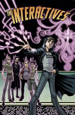
When ‘Interactives’ was in its infancy, there were two artists testing for the book. There was Jun Joe Monares, with minutely-detailed stylized realism painting a dramatic scene.
Luciano Vecchio’s approach favoured bold lines dancing sharply through the page, focusing our attention on the characters’ expressions and dropping us in the centre of the action.
Both tests were unique and a tantalizing visualization of what had previously only existed as written word.
After lengthy, agonised ponderings, Peter settled on Luciano. Harry Markos of Markosia showed us the green light and more than a year and hundreds of pages followed.
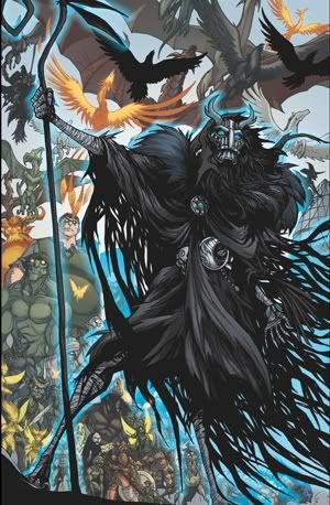
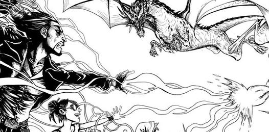
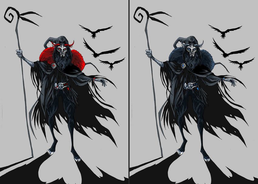
I learned a lot about comic colours not only from the art itself but also from Luciano, who had certain ideas about the characters, Lord Legend especially. When a page first reached me, I opted for reds in Legend’s costume to flag the dangerous and powerful streak to the character. When Luciano’s colour guides arrived, it was clear that he envisioned a blue-grey colour scheme, flecked with silver and bright blue gems. Luciano saw Legend as a ‘big bad wolf’, a subtle character moving with the shadows, directing his armies from the sidelines. Peter and I agreed readily.
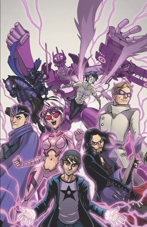
The truly collaborative atmosphere, one where there was an openness to new ideas, was the best part for me personally. This creative freedom came to the forefront when we found ourselves on issue two of the novel, as Lord Legend’s armies make their push into the city. Our heroes are at their lowest ebb in the story and it felt natural to reflect this change in atmosphere in the colours. It was at this point that I suggested the setting sun and the approaching night to reflect the mood.
The loss of colour and the cool hues would symbolise a loss of hope. Then, when heroes finally lift their heads in issue three, the emotional impact is increased when the sun dawns on their triumphant return to action.
While the time of day wasn’t mentioned in the script, it was a relief that my suggestions were accepted and I’m grateful to have been able to add my own signature to the work.
By the time the project was finished, I measured the distance we’d travelled in hundreds of pages. Looking back at the cover coloured in 2009, I decided that I owed my best to the project and decided to rework it, it became a rare opportunity to gain a perspective on the gradual progress.
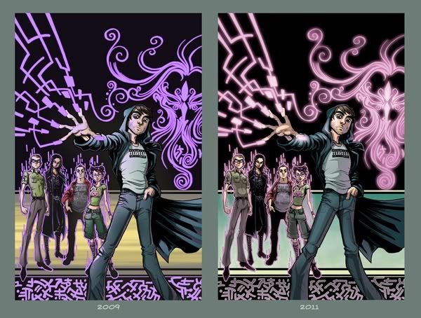
My technique developed and became more structured. Gentler colour choices, no longer garish, played softly in a now focused light. Shadows too, once meek scratches became bold angular shapes working in unison with Luciano’s bold graphic style. The page no longer screams; it guides the eye gently through itself.
Every fresh page still teaches me something new and presents an interesting challenge, one that I always look forward to... all the better if one works with such open, talented and fantastic people like Peter Rogers, Luciano Vecchio and Ian Sharman.
~YZ